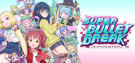
I like digging a bit to find some interesting games, and this was certainly interesting. It had a demo that was pretty fun, but it had some issues to it, namely the controls being garbage with a mouse and keyboard. It was a pretty cool roguelite deck-building game, pretty similar to Slay the Spire.
Well I grabbed it when it came out and now I’m gonna review it… yay!
Let’s go!
Developer: BeXide Inc.
Publisher: PQube
Release date: August 12, 2022
Platforms: Switch, PC, PS4 (Switch version reviewed)
Genre: RPG Beat ’em up
Review
There’s not much to talk about story-wise. A few girls are noticing some of their video games are no longer functioning. A person name Naruta, and a black cat avatar called… Black Cat… Come in to say heroes are needed to save gaming from evil. Someone’s been infecting games, making them unplayable. So you go into the games to fight off the bugs that are being inserted into them, where some of the games’ characters are acting unlike their usual personality and trying to stop you. It’s basically just very mild filler to give an explanation for the gameplay, which is fine.
So you progress through the game by getting into the games, one at a time. Each game has a few maps, which are big grids of icons that go from a starting point to an endpoint. Similar to Slay the Spire, you are on a spot on the map, and you can progress to any connected point in the grid that is ahead of you (you can’t move backward). Each point on the grid has an icon that represents what you can do there. There are fights, “events”, shops, treasure chests, and rest spots.
Events are just conversations with some of the girls that represent the cards. These are randomly chosen from a set. Some are quizzes or requests, you’ll get a reward (or negative effect) based on your responses. Sometimes no response is required. Shops sell a random set of items, a very expensive card of the shopkeeper (which is possible to get otherwise) and allows you to trade scout tickets for cards (more on that later). Treasure chests make you choose from 3 of them, and you get whatever secret reward is there. It’s always one item, money or a card. The cards here are usually pretty good. Rest spots allow you to recover 30% HP for free, pay for more healing, or replace a card’s cartridge (more on that later). And fights are fights. You get cards and money for winning. Yay.
Fighting is fairly straightforward. You draw cards and play them. Cards deal damage, generate shield (stops damage equal to shield value until your next turn), generate armor (which is like shield but stays as long as it gets completely destroyed by attacks), set up combo (when you do 10 combo, you deal a pile of damage), acquire heartsplosion, summon drones, give special passive effects and various other things. Some cards may have some negative effect for damage (such as discarding cards). You always see what the enemies will do on their turns, as icons under them (more on that later). Each card has a cost. That cost is seen in the “timeline” at the top, which shows in how many “turns” the enemies will attack. So a card that costs 2 will move that timeline 2 spaces. Whenever you play a card, you always draw another after. If an enemy attacks, this counts as the end of your turn (so any end of turn effect happens, then after the enemy attack, you get start of turn effects such as your shield disappearing). So yeah… try to protect yourself with shields, try to get the enemy HP down to zero, try to manage your card cost usage. Fairly straightforward stuff. Combat is pretty fun.
Deck-building is a bit of an issue. The problem being, each “game” in the game has a focus in what their cards do. Aquarhythm cards have the combo mechanic, the Seasons one has the heartsplosion mechanic, the Phoenix one has the drone mechanic, and more. The problem in general is that there’s not really synergy. In the earlier levels, you get focused starter decks that will always do well with a specific type of card, but in later levels you get these mixed starter decks with a bit of everything. If you have just a bit of combo or heartsplosion, you’re likely not activating either during battle. So if you don’t focus on one, you’re just getting an underwhelming deck, and sometimes the luck isn’t on your side as far as getting cards that go well with each other. It’s just weird how this is very similar to Slay the Spire, but I never found deck-building to be this complicated in that game. It’s not always bad, sometimes things line up decently and you end up building really awesome decks, but it’s not very consistent.
Also scouting is a way to get cards which is a bit too random. It has you choose from 2 sets of 3 traits. Each card has 5 traits (things like “calm” or “hasty” or the game they come from), so choosing 2 traits will get you a card of at least one of those traits… good luck remembering the traits for literally any card, and then being lucky enough to get the one you want if you do remember any of them. Each card has 4-5 traits, and those traits do kinda nothing until a cartridge affects them (and some cards have effects for “the next card play with this trait” and such). Like, say, a cartridge that says “+2 attack to all calm cards”.
So now I need to get into all the negative shit.
A big problem with this game is that it controls like ass. And what’s surprising about that is… it’s a game where you click on cards, then click on targets. But it’s weirdly awkward, I can’t quite explain it. It’s hard to cancel out of things and it’s weirdly unresponsive. I don’t know how this happened. Have the devs not played Slay the Spire? That game controls amazingly.
The biggest problem with this game is that the game refuses to tell you what anything does in a way that’s logical. When you get a passive buff from a card, it puts an icon under your character’s portrait. Want to know what that icon means (maybe you didn’t read it when hovering the card, or just forgot what it does)? Fuck you. There’s literally no way to know. In a good game like Slay the Spire, you can hover over an icon and it will tell you what it does. Not this game. If the effects had icons that were a good representation of the effect, but they’re not. Also if you have over 6 of the icons, any more than that just disappears. The effect still happens, but you can’t see it. This is the same with icons showing what the enemy will do.
And these special effects do not have reasonable names that tell you what they do either. Can you guess was “Singulacode 73” does? Well that gives all your cards +3 attack. What about “Singulacode 96”? Well that gives all your cards -1 cost and +1 attack, plus it gives you 1 HP and 3 shield at the end of a turn. What about “Charonia’s Haughty Heart”? Well that’s +1 combo at the end of your turn. All the effects are weirdly-named and have stupid, unrepresentative icons. And those effects, the game doesn’t tell you what they are when you’re looking at your deck separately. The only time you see the effect is if you hover over it when the card is in your hand. Many of these effects are on cards that exclude themselves from your deck for the rest of the battle too, so you don’t get to see that again.
The icon issue continues with cartridges. Cartridges are something all cards are basically placed into, which give extra effects to the card, or passive effects for your character as a whole. The effect may be something like recovering 1 hp, it may be buffing the cards attack, it may be giving bonuses to all cards in your deck based on traits, it may make the more expensive rest point free, and various other things. You get to know what the cartridges do when you upgrade the card (which will get a random cartridge), after that, you can see it looking at your deck. But when you’re in battle and don’t want to waste time doing that every time you play a card, you’ll have no idea what your cards do alongside the cartridge. You CAN go into the deck list and find the specific card, but that’s kind of a waste of time. The only effects you’ll see is if attack is buffed in some way. A bit ridiculous when they could just tell you the effect by hovering the card.
So you have cartridges that are annoying to check what they do, and you have icons that actively refuse to tell you what they do, and each card has 5 traits which… how the fuck are you means to remember any of them? With the icons, the cartridges and the traits, that’s a lot the game really expects you to remember based on basically nothing, and it makes playing the game a little bit of a mess a lot of the time.
Overall
It’s no Slay the Spire, but it’s a good game. It’s just really unfortunate that the game is absolutely horribly developed and covered with very basic gameplay and UI design mistakes.
I just don’t get why it makes gameplay design mistakes that are just so easy to deal with when you have a mouse pointer. Wonder what an icon means? Hover over it and read what it means in a pop-up box. That worked for Slay the Spire and Monster Train. But not in this game. You’re just meant to know that “Rinko’s Juice” means “deal 2 damage to all enemies when you discard a card”.
Like, the deck-building is pretty fun even though it needs work and more synergies, the combat is great, the character designs are very nice, but man all the basic functionality shit really brings it down.
This game, even though I liked it, does not get a recommendation. It needs to be pretty majorly fixed before I recommend it to anyone.


Leave a reply